Pixel-perfect UI with Flutter: From Figma to Final App
- 5 сент. 2025 г.
- 4 мин. чтения
In many projects, clients and designers face the same challenge: the Figma design looks flawless — precise spacing, clean typography, perfect shadows and colours. But when it comes to implementation, the on-screen result doesn’t quite match. Spacing shifts, colours aren’t quite right, fonts don’t follow the design guidelines, and shadows appear differently. The result? A poor user experience and extra costs for fixes and rework.
Fortunately, there’s a solution — Flutter. This framework allows developers to implement a pixel-perfect interface that matches the Figma design exactly, with no compromises, across both platforms. In this article, I’ll share how we achieve this level of visual accuracy, why it matters for your business, and what tools help streamline the process.

Why Pixel-perfect Design Really Matters
For users, the UI creates the first impression. If the layout feels off, the product may seem unprofessional or low quality.
For businesses, this can result in:
📉 Reduced trust in the brand
🛠 More rework and bug reports after testing
💸 Missed conversions and lost customers
How Flutter Helps Achieve Pixel-perfect Design
1. Full control over every pixel
Flutter doesn’t rely on native platform components. Everything is rendered using its own engine, allowing precise reproduction of any layout — including complex shapes, gradients, shadows, and animations.
➡️ This gives developers confidence that every element will look the same on any device.
2. Consistent behaviour on iOS and Android
One codebase = consistent behaviour across all devices. The UI looks exactly the same on both platforms, eliminating the need to manually fix platform-specific differences.
➡️ This is especially important for brands that want to maintain a unified visual style everywhere.
3. Support for custom graphics and complex layouts
With tools like CustomPaint, ClipPath, BackdropFilter, ShaderMask, Stack, and Positioned, you can recreate any design element.
➡️ Even the most unconventional elements and animations are easily implemented using Flutter’s native capabilities, without extra libraries.
4. Fast iteration
Hot reload lets you instantly see UI changes during development. This speeds up communication with designers and reduces the number of review cycles.
➡️ It makes the development process more flexible and cuts down approval time for layout adjustments.

How We Work with Design Mockups
To achieve maximum accuracy, it’s essential to build an effective collaboration process between designers and developers. Here's how we approach it:
🔍 Pixel-by-pixel comparison
We don’t rely on visual guesswork — we use tools like Figma Inspect, Pixel Perfect, and Flutter DevTools Overlay to compare the implementation with the design. These tools help detect even the smallest deviations in spacing, colors, and sizes.
➡️ This kind of precision check is especially critical in the final stages, when even a 1-pixel shift can affect how polished the interface feels.
🧩 Atomic design approach
We break down the interface into reusable components — buttons, cards, input fields — and implement them as independent widgets. This increases scalability, simplifies testing, and makes edits much easier.
➡️ It also reduces visual inconsistencies across different screens and saves time when building new UI parts.
📏 Strict adherence to design guidelines
We follow all specifications from Figma — sizes, fonts, colors, spacing — down to the last pixel. Even a 1-pixel mismatch gets noticed and fixed.
➡️ This ensures a consistent visual language throughout the app, which is crucial for professional design and strong branding.
🔄 Alignment before and during development
Before starting, we go through the mockups with the designer to clarify interactions, animations, and loading states. During development, we keep communication open to quickly resolve edge cases or inconsistencies.
➡️ This reduces the number of revisions after handoff and speeds up the overall delivery process.
Practical Example: Building a LinkedIn Clone in Flutter
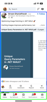
In one of our articles, we recreated the LinkedIn interface from scratch to demonstrate how Flutter can deliver pixel-perfect precision, even when replicating a complex real-world UI.
Here's how we approached it:
📐 Analyzing the original interface — We carefully studied the live LinkedIn app: element sizes, typography, spacing, shadows, and button behavior. Without access to design files, we manually replicated the layout using screenshots and measurements.
🧱 Modular structure — The screen was broken down into reusable components: post cards, avatars, action menus, reaction buttons, and the navigation bar. Each part was implemented as an independent Flutter widget.
🎯 Pixel Perfect Overlay — To validate our implementation, we overlaid screenshots of the original UI on top of the app in the emulator. This helped us spot and fix even the smallest discrepancies.
📲 Cross-device testing — We tested the interface on various screen sizes, both Android and iOS. Flutter handled consistency across platforms with no need for platform-specific tweaks.
➡️ This experiment clearly showed that Flutter can faithfully reproduce high-fidelity, real-world interfaces — even without a Figma design — using only engineering discipline and the right tools.
Conclusion
Pixel-perfect implementation isn’t about perfectionism for its own sake — it’s about the kind of detail that shapes how users perceive and trust your product. Flutter gives us everything we need to bring designs to life exactly as intended, with no compromises.
In our workflow, visual precision is just as important as performance and stability. A clean, accurate UI isn’t a luxury — it’s the standard for any modern digital product.
📩 Want your design to look exactly like it does in Figma?
We can help you implement your interface down to the last pixel — no matter how complex it is. Reach out to us, and we’ll show you how Flutter turns mockups into real, responsive UI.


Комментарии